You know what overwhelms me? Yeah, well, plenty of things. But I am referring to my daily walks from the desk in the quiet room of the library to the restroom or drinking fountain. Book covers! There are just so many of them! There are so many great ones! And surely not all those books can be great, right? can be vying for attention in my very marketplace? Despite all the nasty self-pub covers I see on the internet, I am simply overwhelmed walking past all the lovely and great-idea covers that are out there and for sale in the bookstores or lending in the library.
Yes, I am supposed to be writing. But I have put some chapters on my book today and I was just so restless that I turned to a cover design I had been wanting to change. It’s sort of timely, as in this is the book that will hopefully go to the presses this spring. Anyhow, I love cover design. I have a small bit of experience in it. I could be much better. But then again, there are so any great ideas (perhaps infinite) that I think I can manage one of them every once in awhile.
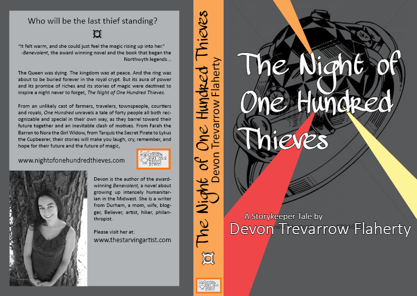
Here is the old version. (Please ignore that the spine is upside down):
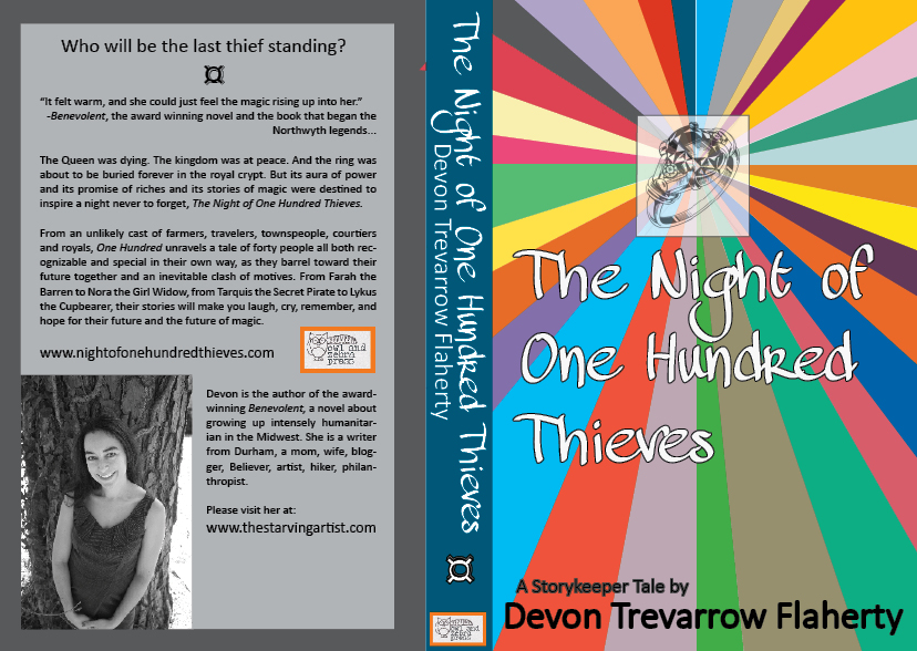
Here is the new version:
Which is better? Honestly, sometimes I am so close to the thing that I just can’t see clearly. That’s why I have a cover buddy. Yeah, since I can’t hire a cover artist (and kinda’ sorta’ don’t need to), I have a friend who is interested in graphic design, books, and art, and he lets me know what’s what. Most days, I think the cover for Benevolent has been serving me well. At the very least, the bold, clear, aqua spine jumps out on a bookshelf. I know; I’ve eyeballed it at the bookstore. And I stare at it every night as I fall asleep.
The point of this?
Give me some pointers. And get back to work.
[UPDATE: The new cover has changed a bit, still needs permissions to become official. So far, lookers-on are split. Here is the newest new version: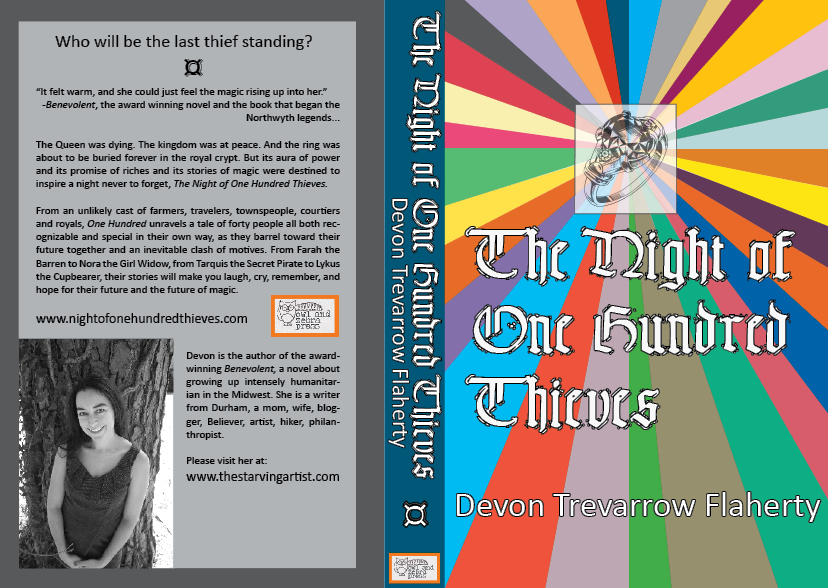 ]
]


I like the first cover. The prismatic tri-color burst does not overwhelm the title and I like the colors. Took me a minute to actually see the jewel behind the title, but the jewel is even more obscure in the second one. The first adds an air of mystery that the second cover doesn’t. I like the layers of mystery in the cover design but clear title: you know what the story is about right away. Hope it helps!
Actually it’s the title that’s more obscure in the second one which is a bigger issue…
On Thu, Jan 16, 2014 at 3:19 PM, Tamekia L. Brandon wrote:
> I like the first cover. The prismatic tri-color burst does not overwhelm > the title and I like the colors. Took me a minute to actually see the > jewel behind the title, but the jewel is even more obscure in the second > one. The first adds an air of mystery that the second cover doesn’t. I > like the layers of mystery in the cover design but clear title: you know > what the story is about right away. Hope it helps! > > > On Thu, Jan 16, 2014 at 2:14 PM, the starving artist <
I’m drawn to the colors on the 2nd one and I can clearly see the title and ring. However, the colorful cover might convey more fun than mystery as with your first cover.
I like the first one best! It’s a little retro in styling in a great way! Plus I prefer the contrast of gray with color coming through!